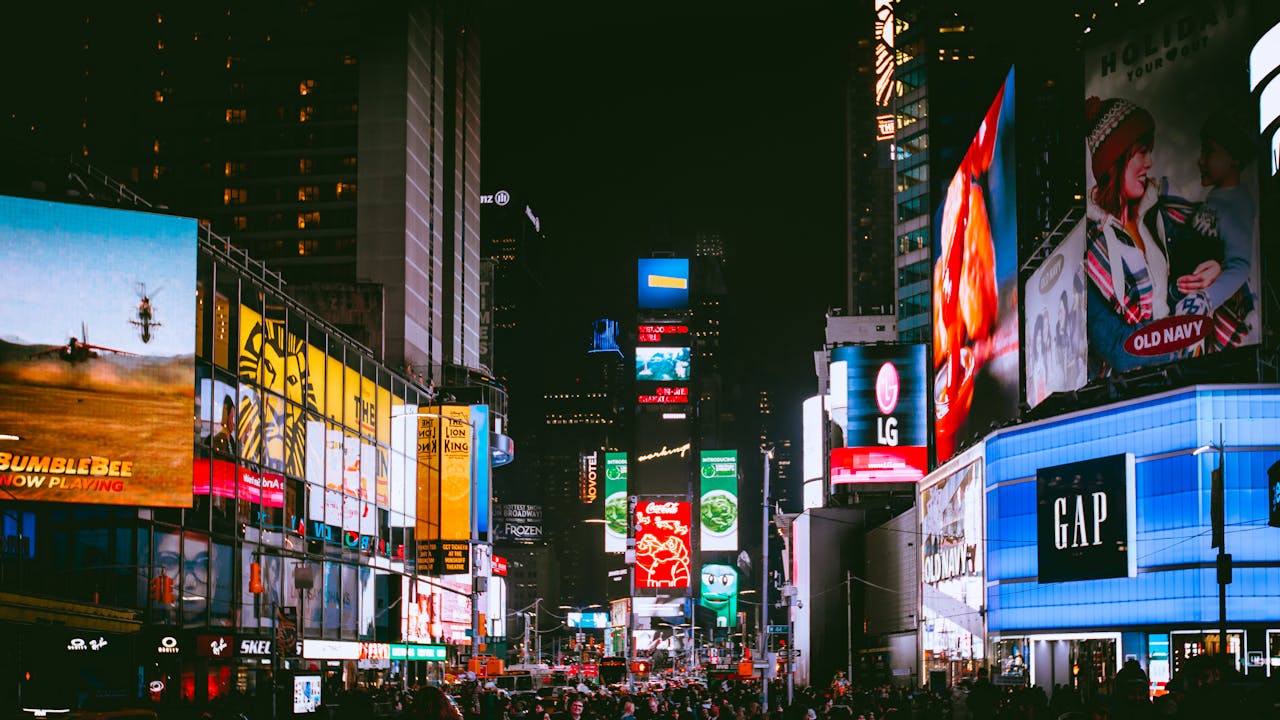
Billboard advertising is a bold, high-stakes medium. Unlike digital ads or print campaigns that people can scroll past or flip through at their leisure, a billboard has a fleeting moment to capture someone’s attention—usually while they’re driving 60 miles an hour. In that moment, everything matters: color, contrast, typography, message, and placement. When it’s done well, billboard advertising can deliver massive brand awareness and lasting impressions. But designing for distance isn’t as simple as blowing up a print ad and sticking it on the side of the highway.
Effective billboard design requires its own visual language. It’s part art, part science, and all about clarity. Whether you’re promoting a local restaurant or launching a national campaign, understanding the visual rules of high-impact outdoor design is the difference between being seen—and being forgotten.
1. Keep It Simple. Really Simple.
This is the golden rule of billboard design: less is more. Unlike a magazine spread or a web banner, a billboard has about 5–7 seconds to communicate its message. That’s barely enough time for a driver to glance up, register the content, and look back at the road.
That means your message must be boiled down to its most essential form. Think of it like a haiku in advertising. One clear idea. One call to action. Ideally, no more than seven words.
Clever headlines, puns, or wordplay are great—if they’re instantly understandable. If it takes more than a second to get the joke or connect the dots, the moment is lost.
2. Prioritize Readability from Afar
Typography in billboard advertising needs to be loud, legible, and bold. Fancy scripts, tight kerning, or delicate serifs might work on a wedding invitation—not on a freeway.
A few rules of thumb:
- Use large font sizes. Letters should be a minimum of 1 foot tall per 10 feet of viewing distance. On a roadside billboard, that often means fonts that are 24 inches tall or more.
- Choose clean, sans-serif fonts like Helvetica, Futura, or Gotham for maximum readability.
- Stick to high contrast. Dark backgrounds with light text (or vice versa) are easier to read than similar-toned combinations.
If you’re unsure, test your design by printing it small and viewing it from across the room. If you can’t read it in 3 seconds, it won’t work on a billboard.
3. Use Bold Imagery, Not Cluttered Collages
A single, striking image is far more effective than a busy montage of visuals. Remember, you’re trying to communicate an idea, a feeling, or a call to action in the blink of an eye.
Great billboard images do one of three things:
- Spark curiosity (an unexpected or surreal visual)
- Reinforce the message (a delicious burger for a fast-food ad)
- Trigger emotion (a smiling face, a moving moment, etc.)
Avoid overly detailed photos or backgrounds that compete with the text. Negative space is your friend. Let the design breathe so the viewer’s eye knows exactly where to go.
4. Color with Purpose
Color can make or break a billboard. It draws the eye, evokes emotion, and helps with brand recognition. But it needs to be used deliberately.
Some tips:
- Stick to 2–3 dominant colors. More than that, and your design risks becoming chaotic.
- Use brand colors smartly. They should be recognizable but not overwhelming.
- Ensure strong contrast. Black and yellow, red and white, blue and orange—pairings like these ensure readability at a distance.
Also, consider the environment. A green-dominated billboard might disappear into a wooded roadside. A pale design might get washed out in bright daylight. Always test in context.
5. Consider Viewing Angles and Speed
Designing for a billboard isn’t just about aesthetics—it’s about physics. A driver might only see your ad from a certain angle and for a few seconds.
That’s why good billboard designs:
- Avoid tiny or peripheral elements that require close inspection
- Place the key message in the center or slightly above center
- Use minimal horizontal elements (since vertical movement is easier for the eye to track when passing by)
In urban settings where foot traffic is slower, you can get a bit more detailed. But for highway billboards, think big, bold, and direct.
6. Brand It Clearly
It may sound obvious, but you’d be surprised how many billboard designs bury the brand name or logo. With such limited time for engagement, your brand identity must be unmistakable.
Best practices include:
- Positioning the logo in a corner, away from the main message but still clearly visible
- Including a simple call to action (like a short URL or QR code, if the location allows for it)
- Ensuring the brand colors and tone match the rest of your marketing
Even if the viewer doesn’t remember the entire message, they should walk (or drive) away remembering who you are.
7. Think Beyond Static
With the rise of digital billboards, there’s more room for creativity. But the same rules still apply—simplicity, clarity, and timing.
Digital boards can rotate messages every few seconds, which means you can break your content into a short sequence. But don’t rely on fast transitions or animations that require attention spans longer than a few seconds.
Use motion sparingly and strategically: a flashing light to draw the eye, or a subtle shift that reinforces your message. Think of it like punctuation, not prose.
Final Thoughts: Designing with the Viewer in Mind
At the end of the day, billboard design isn’t about cramming in as much information as possible. It’s about making a single, unforgettable impression in a matter of seconds.
The best billboard ads don’t just share a message—they leave a mark. They’re the ones that make people laugh on their morning commute, remember your brand when they need your service, or talk about your clever headline over dinner.
So when you’re designing for distance, don’t think of it as limiting your creativity. Think of it as sharpening your focus. When done right, fewer words and bigger ideas have a far greater impact than any overloaded design ever could.


Leave a Reply